Case study · UX Design · E-Commerce · Brand Experience
Furcy Botanik Website Redesign
Hypothesis → launch → observe → learn → iterate.
Turning a bold visual concept into a more purposeful e-commerce experience.
01
Project Overview
Furcy Botanik is a botanical skincare startup built around rare botanical ingredients. The brand had a strong product story, but its existing digital experience was not effectively supporting engagement and orders in a crowded skincare market.
I joined the project as a UX Designer and collaborated with the head designer and marketing team on a full website redesign. The project began with a clear creative hypothesis: make Furcy Botanik look and feel dramatically different from conventional skincare brands. After launch, we used behavioral feedback and real-world marketing constraints to refine that direction.
02
The Challenge
The existing website lacked the level of differentiation and clarity needed to communicate Furcy Botanik's value in a saturated skincare market. The redesign therefore had to solve two problems at once:
Create a memorable digital experience that clearly differentiated the brand.
Make the shopping journey easier to understand and use, particularly on product detail pages (PDPs).
Support product storytelling without overwhelming users with content.
Ensure product imagery and other design assets could work beyond the website in marketing channels.
Design challenge — how might we
Create a skincare website that radically stands out from competitors without compromising usability, e-commerce performance, or marketing adaptability?
03
My Role
This was a collaborative redesign rather than a solo project. As the UX Designer, my contribution focused on the structure and usability of the experience while working within the broader creative direction.
UX structure and content hierarchy
Product detail page information prioritization
Design exploration and iteration with the head designer
Reviewing post-launch user behavior and heatmap/analytics signals
Identifying opportunities to simplify the product experience
Balancing visual ambition with usability and marketing requirements
Collaborating with marketing and development on practical implementation considerations
This distinction is important: the overall visual direction was a team effort, while my UX contribution centered on helping make the experience clearer, more usable, and better aligned with observed behavior.
04
Initial Direction — STAND OUT
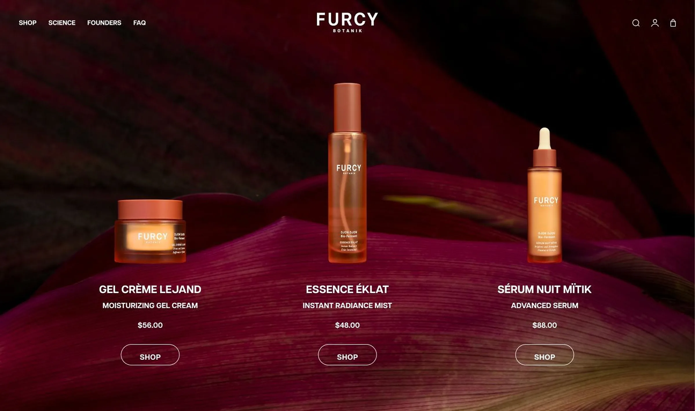
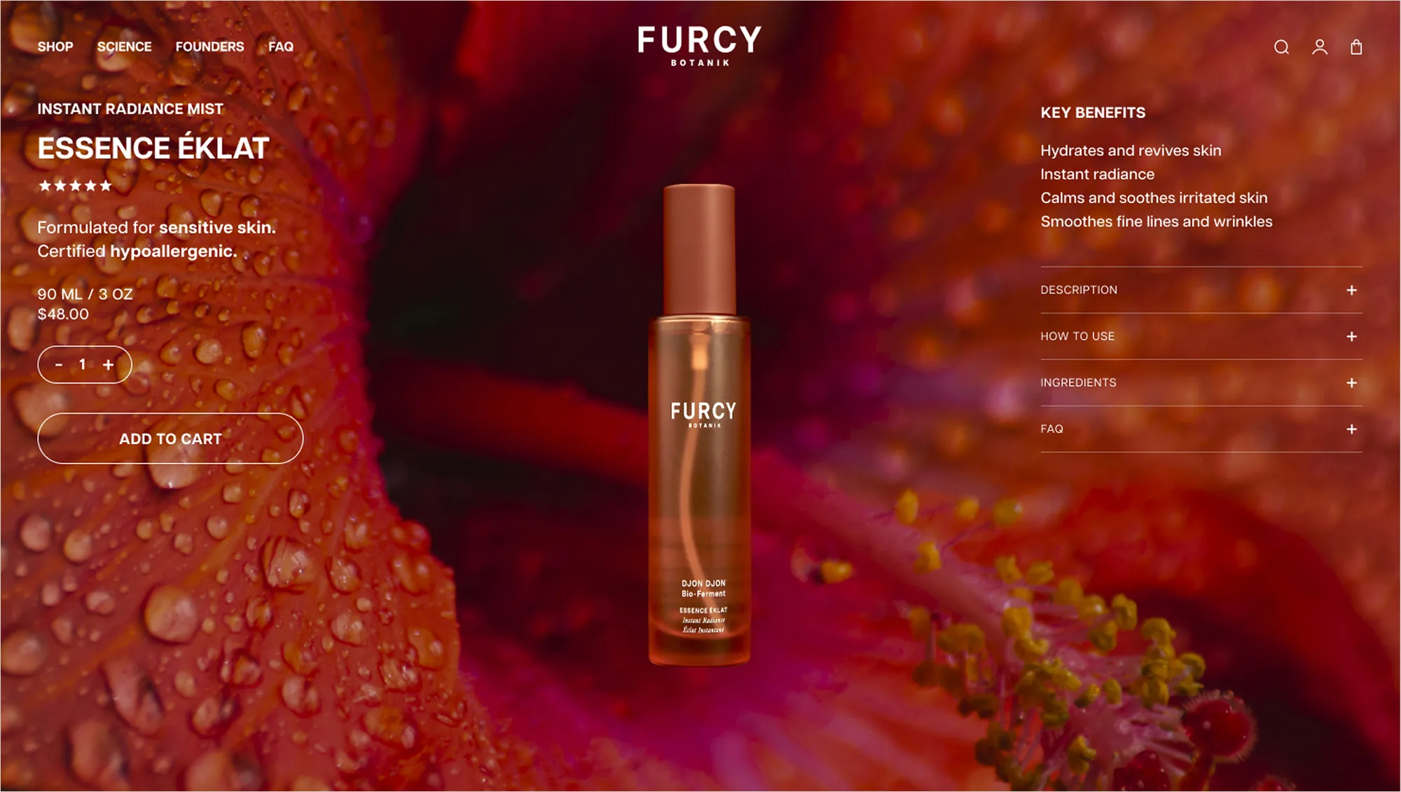
The first design phase intentionally moved away from familiar skincare conventions. The goal was to make Furcy Botanik immediately recognizable and memorable rather than look like another muted, template-driven beauty site.
Initial hypothesis. A stronger visual point of view could help Furcy Botanik stand out and communicate the uniqueness of its botanical ingredients.
05
Version 1 — What We Learned After Launch
The first version successfully delivered on the creative goal, but launch exposed issues that visual design alone could not fully predict. This became the most valuable part of the project: the team could evaluate the experience using real-world behavior and downstream marketing requirements.
Insight 01
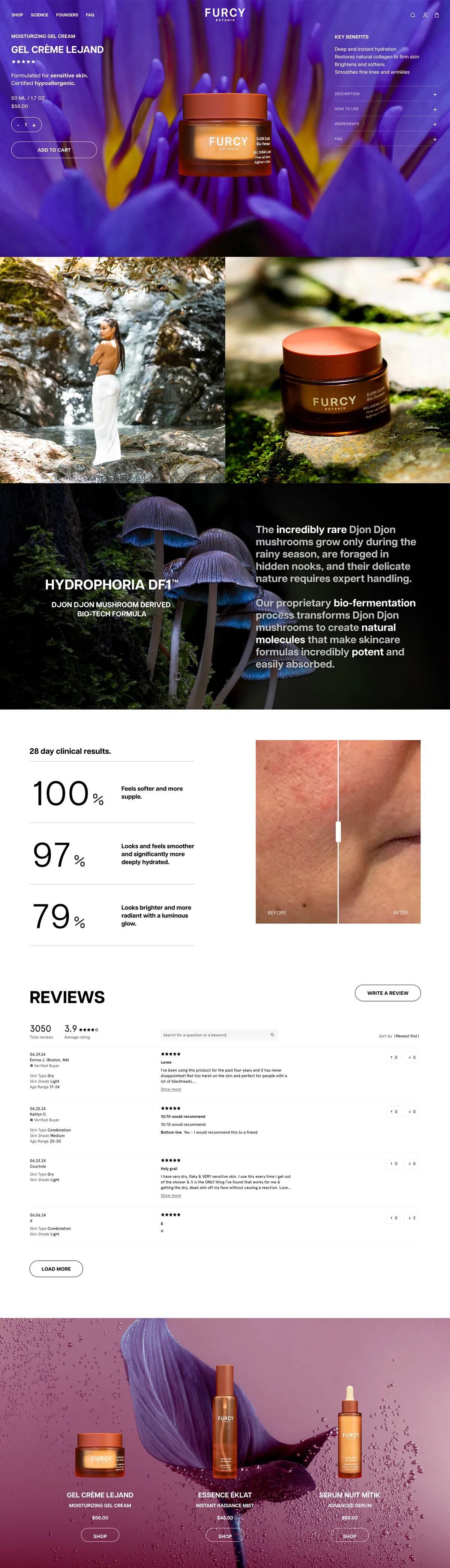
Users were not reaching the lower PDP content
The original PDPs contained approximately six to seven content sections covering ingredients, testimonials, usage, benefits, and other supporting information. Behavioral review showed limited scrolling and very short time spent on PDPs, suggesting that the amount and ordering of content were not matching how users were actually consuming the page.
Insight 02
Product assets had to work outside the website
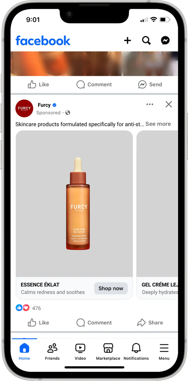
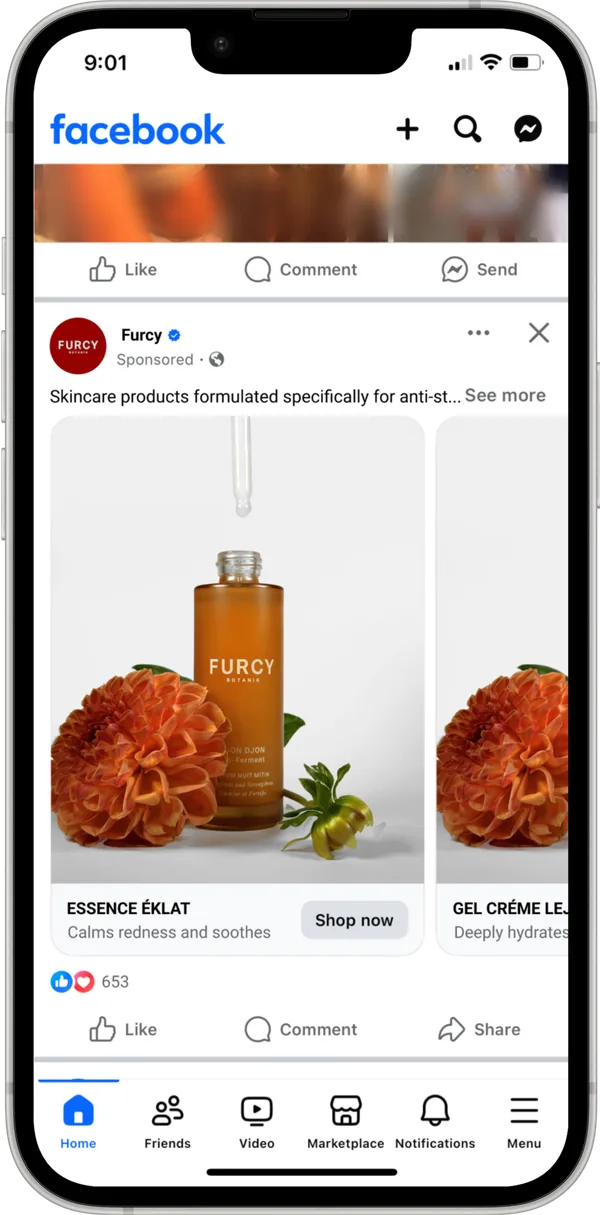
Transparent-background product imagery created an immersive effect on the website because the colorful page background could show through around the product. However, when the product image was pulled into Facebook advertising without the surrounding website background, the transparent area could appear white or gray. The visual system therefore needed to account for the full customer journey, not only the PDP.
The question changed from “How can we make the website more distinctive?” to “How can we preserve distinction while making the shopping experience easier to understand and use?”
06
Iteration — From Bold to Purposeful
Rather than treating the first launch as a final answer, we used the evidence to refine the experience. The second phase preserved the brand's expressive personality while reducing friction in the shopping journey.
01
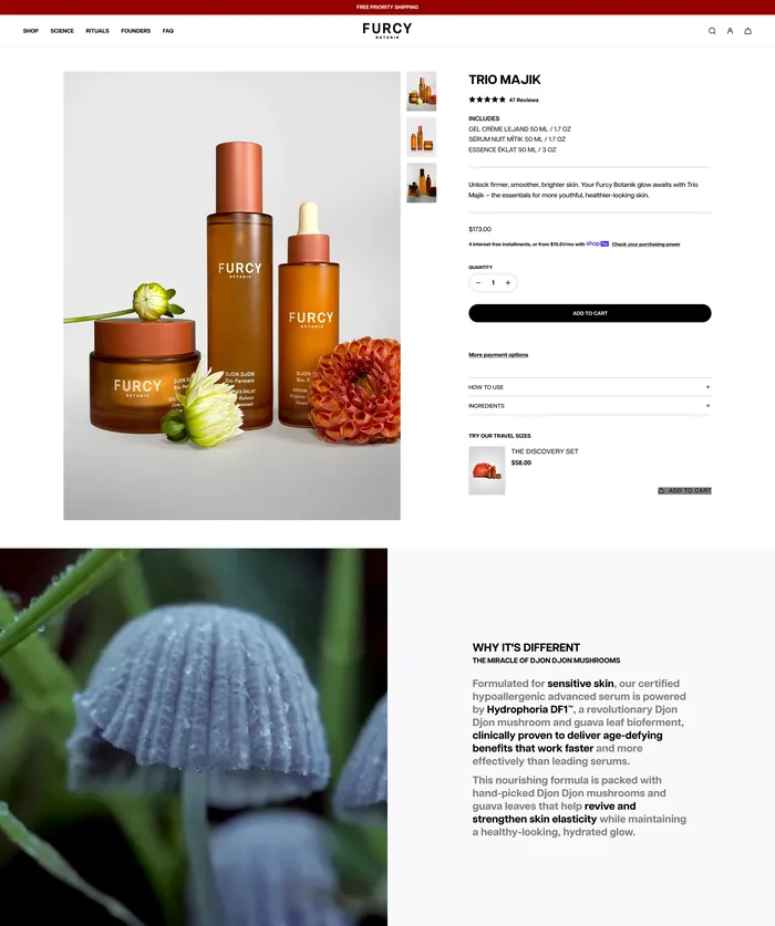
Simplified PDP structure and reduced unnecessary content density.
02
Prioritized product benefits, imagery, and clear calls to action earlier in the page.
03
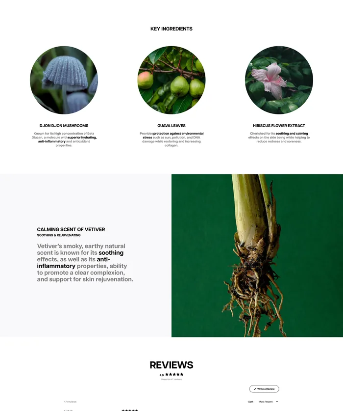
Improved information hierarchy so shoppers could understand the product more quickly.
04
Reconsidered transparent product imagery as a primary e-commerce asset.
05
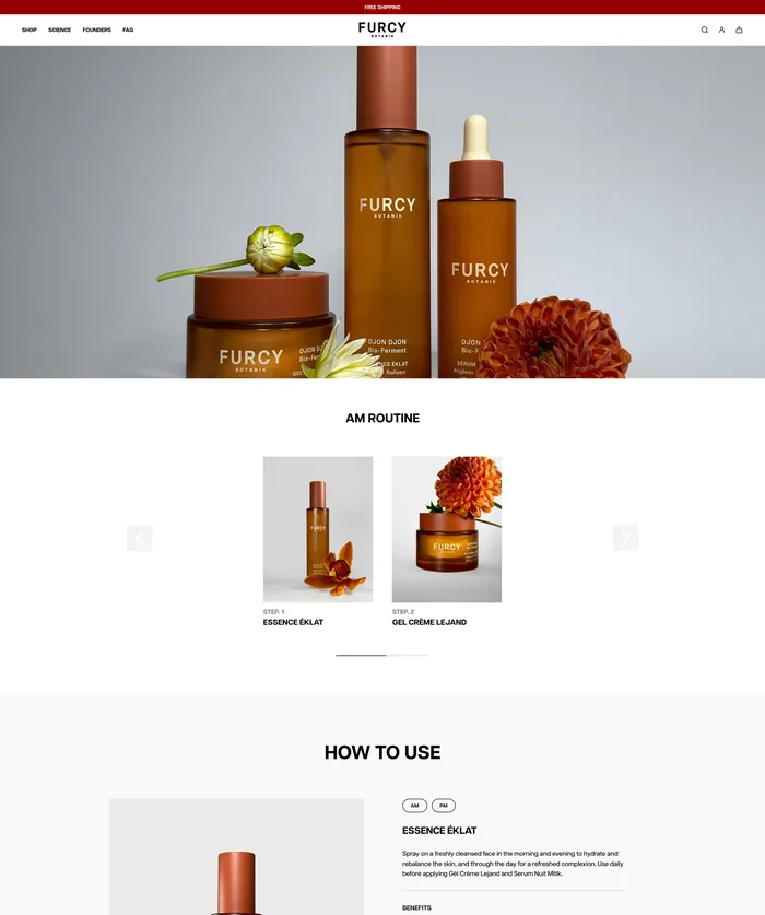
Created product visuals that were more adaptable to advertising and other marketing placements.
06
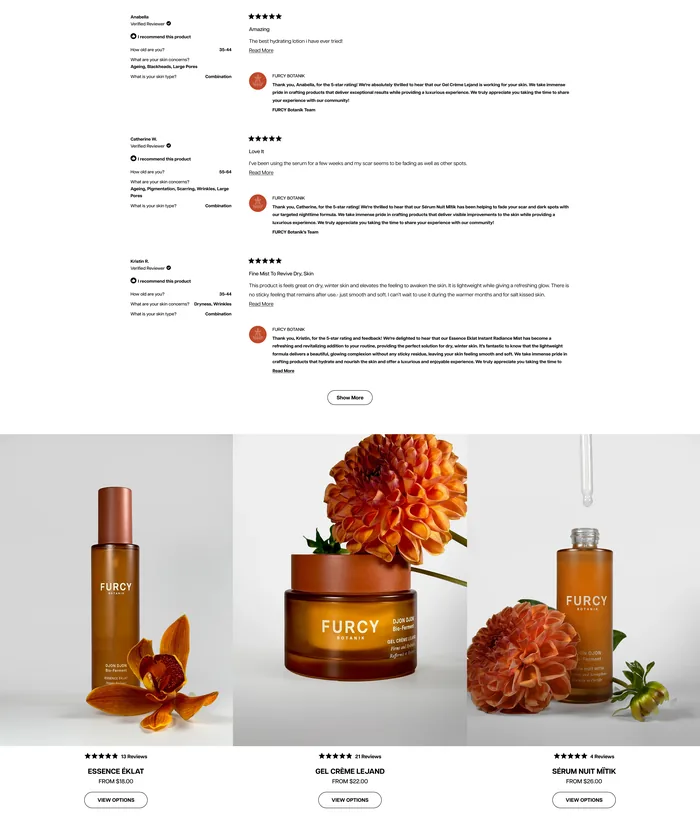
Moved the shopping experience toward more familiar e-commerce patterns while retaining standout brand elements.
07
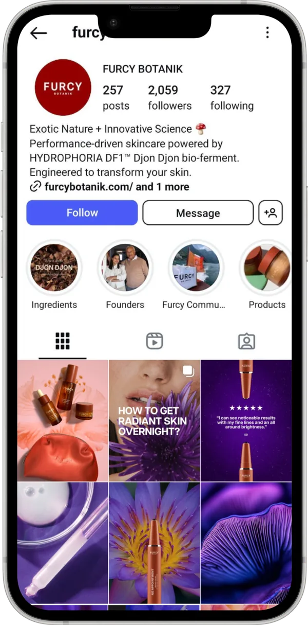
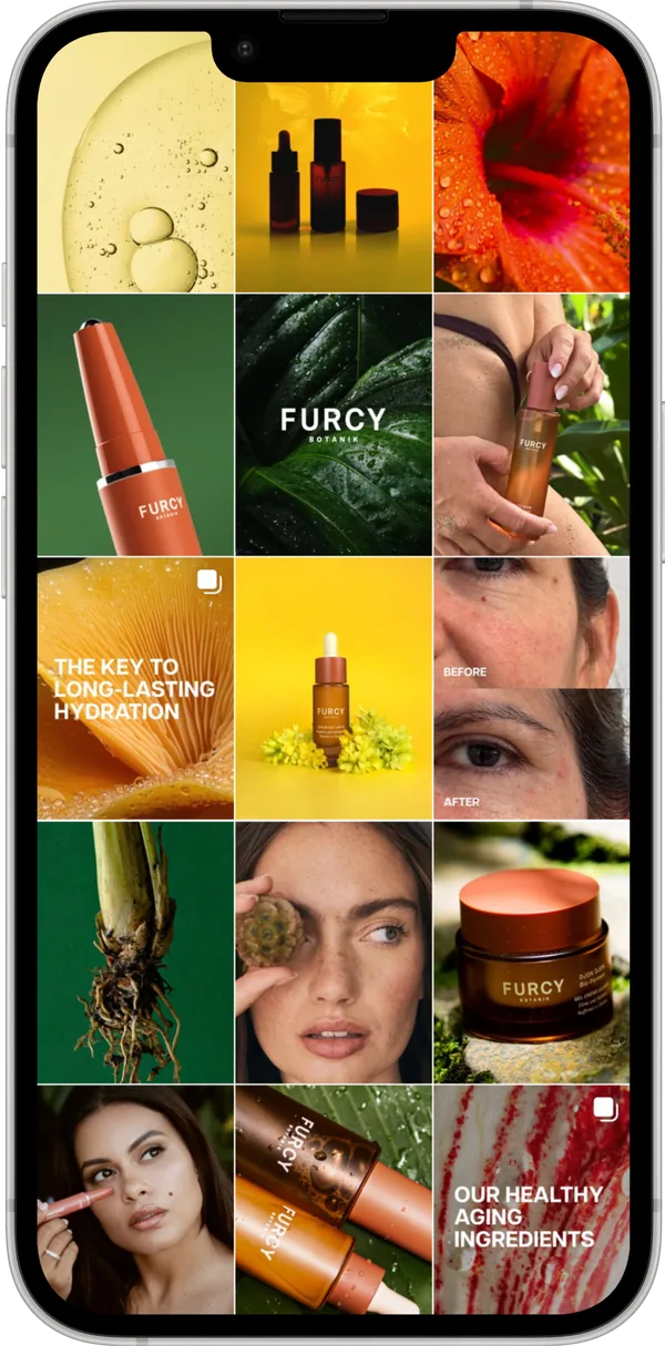
Repurposed expressive visual concepts for Instagram and social content where they could preserve brand voice without creating PDP usability issues.
Version 2 — from bold to purposeful
Simplified PDP structure, familiar shopping patterns, standout brand elements retained.
Beyond the website
The same system, working where the website ends
Product assets rebuilt so they hold up in paid placements, and the expressive botanical concepts moved to the channel that could carry them.
07
Results & Impact
Figures reported in the original project presentation, comparing the initial and updated experience.
Average time on PDP
8 sec
Before
30 sec
After
Add-to-cart rate
2.8%
Before
4.6%
After
Beyond the reported metrics, the second iteration produced a more focused PDP experience, better alignment between website and marketing assets, and a clearer path from product discovery toward action.
08
What This Project Taught Me
UX extends beyond the website. E-commerce product assets often travel through ads, social media, email, and other channels.
A visually successful solution can still create usability or business problems after launch.
Real user behavior can challenge assumptions made during design.
For e-commerce PDPs, more information does not automatically create more value.
Familiar shopping patterns can reduce friction when users are trying to make a purchase efficiently.
Iteration is part of product design: launch, observe, learn, and refine.
Cross-functional collaboration becomes essential when UX, visual design, development, marketing, and business goals intersect.
09
Reflection
Furcy Botanik was one of my early projects as a UX Designer, and it changed how I think about e-commerce design. I learned that strong visual design is only one part of the experience. A product page also has to help users quickly understand value, support a clear path to purchase, and function as part of a larger marketing ecosystem.
The most important lesson was not that the first design was wrong. It was that a product experience becomes stronger when the team treats launch as an opportunity to learn. We started with a bold hypothesis, observed real behavior, identified friction, and iterated toward a more purposeful balance of brand expression, usability, and e-commerce needs.
More work